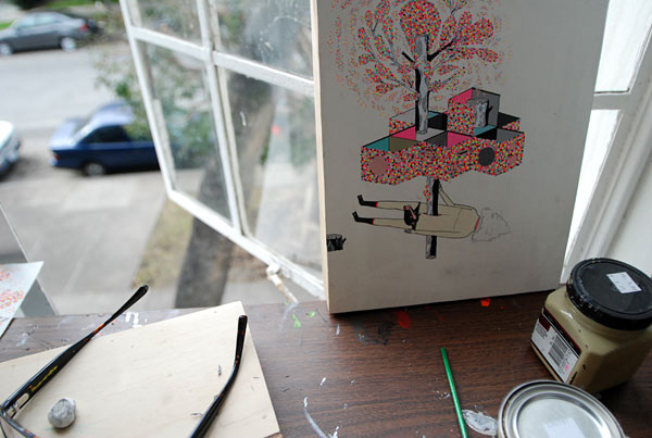
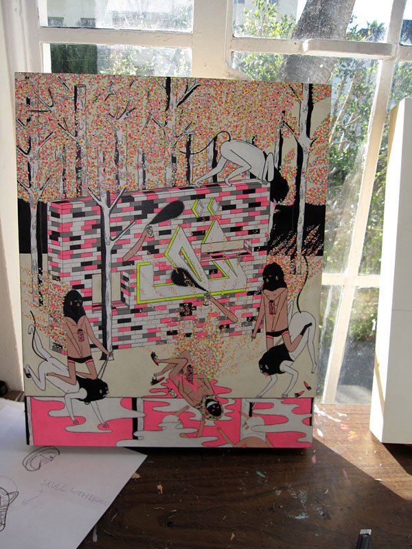
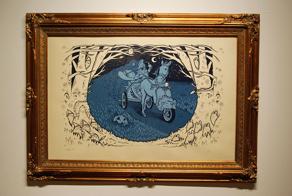
Mondays are sometimes difficult for me, and today was no exception. Getting up early has never been an easy task, especially over a long period of time. Just ask Momma D- I assure you that even the mention of the phrase "morning person" around her will ignite her into such a frenzy of explanation about how I am simply NOT ONE OF THOSE PEOPLE that your ears will literally bleed at the montage. Still, somehow after our debaucherous weekend filled with cooking spaghetti and re-planting our herb garden I managed to ooze my way out of bed this morning to get to work by 7 sharp. It takes me longer than usual to get into my normal work mode on Mondays after actively atrophy-ing my brain into mush over the weekend, so I was perusing some of my personal emails and came across Fecal Face's Kill Pixie interview. I'm sure that at one time or another I've come across his work, but the vivid colors really struck a chord with my addled brain cells not quite functioning on 100%. Also I am very jealous of his LA pad. I would hate to live in LA for any other reason besides art, but I think I would thrive there as an artist. Then again, that's what everyone says.
Regardless, here's some of his drool-inspiring work.
These are all taken directly from Fecal Face. He's got a few shows coming up, one in LA and one currently in Australia. Some life, right?!?
Monday, March 23, 2009
Kill Pixie
Labels:
art,
awesome,
california,
cool stuff,
drawing,
fecal face,
gallery,
interview,
painting,
sketch,
studio
Wednesday, March 18, 2009
Ryan McClennan
Ryan McClennan is an artist from Richmond who's making big strides in the art world today. The first exposure I had to his work was his cover of RVAMag a year or so ago when he was promoting an in-town show, but now he's moved on past lil' ol' RVA! He's been featured on Tiny Showcase a few times already, and who knows what else he's got his fingers in. His intricate illustrations of nature beautifies the violence and intensity in a world we can't fully immerse ourselves in.
Check out his site and tinyshowcase to see more of his work.
Labels:
animal,
art,
cool stuff,
illustration,
nature,
prints
Friday, March 13, 2009
Stuart Kolakovic
Every once in a while I get really bored with whatever my current desktop image happens to be, but it's not always the simplest task finding a new one. You don't really realize how much you actually look at it, and if it's just not quiiiiite right, it will bother me until I find The Perfect Image. Usually my go-to's are FecalFace and Tiny Showcase, and today proved no exception. I scanned through the archives of Tiny Showcase to come across the work of Stuart Kolakovic, a UK artist that I could only find a little information about, but his work speaks for itself. Folk art, cubism, and retro color theory are all explored through his works. He's worked as a comic artist and illustrator with a pretty impressive clientele. Check out his site and especially his comics.
And FYI, here's the image I have as my background now:
Worship Something, Tiny Showcase
Here's just one that I especially like (the geometric patterns in nature is a concept that I've explored for years. I actually based my AP portfolio on it in high school):
Arctic Chilling, personal work
And FYI, here's the image I have as my background now:
Worship Something, Tiny Showcase
Here's just one that I especially like (the geometric patterns in nature is a concept that I've explored for years. I actually based my AP portfolio on it in high school):
Arctic Chilling, personal work
Monday, March 9, 2009
New fonts!
Veer came out with a new font collection with Dessau Pro by Gábor Kóthay, and while I'm not usually immediately drawn to Bauhaus-styled imagery, something about this family of sans serif fonts appealed to me. I think it is one of those irrational prejudices that I carried with me from a younger age without ever questioning it, but you would think with my love for "rounded edges and bright colors" I would be more open to this sort of design! Nevertheless, here is their little blurb about the font itself:
Dessau Pro is an extensive Bauhaus-influenced sans serif family with 11 weights and extensive alternate glyphs. Without question there are Hungarian influences, and many authentic letterforms (using samples from various Bauhaus designers.) In part in can be considered a commemoration of Hungarian designers/teachers (Breuer, Moholy-Nagy, Molnár, etc., and to new Bauhaus (Mies van der Rohe, Le Corbusier and Kassák).
The letters were originally designed for various installations in 1987 (Academy of Fine Arts, Budapest.)
The options and customization for this font are really fun and interesting. I'm predicting even more of a resurgence of this retro look in design. By 2009, I feel fairly confident that all the good design has already happened, but from what I can see on the market today people are using their own innovations to improve the past and push it even further.
Thursday, March 5, 2009
This week with Core77
It's always a bittersweet moment when I get the monthly Core77 emails. On one hand, it's always refreshing and inspiring to get a first hand look at brand new design and what people are really creating all over the world. Now that I'm out of school and in a non-art saturated environment for the first time in my life, I have to make sure I keep on top of what's going on. On the other hand, it's super depressing to NOT be in that sort of atmosphere on a daily basis. I try to use it as a motivator to keep myself in tune with the creative juices.
Regardless, this email contained some of my favorite topics inside and outside the realm of interior design- toys and books! The New York Toy Fair (aptly titled "Inspiring Growth") just ended and Core77 was there to capture all the highlights of 2009. They got some great photos that can be seen here, and the show site can be viewed here. I mean, how awesome would it be to just hang around the newest (and some of the classics!) and hottest toy designs and play all day??? Here's a couple of my favorites:
Great dolls by Lunar Loft. Reminds me of uglydolls, but more like cute robots.
Crystallized Swarovski Lamborgini by Maisto. The ultimate bling for any child under 7.
Lego- never a disappointment. How can I live so close to Legoland but have never been???
A new name to me, Kosen's wrinkle-pup made me smile.
I love wooden fruit. It's an oldie but goodie. Just something about the simple, familiar shapes in miniature is comforting. Not necessarily the most innovative, but still a classic (this one by Estia Holzspielwaren)
The only thing better than a real s'more is a fake one, I guess... by Reel Roaster
This little world, perfect for a munchkin or small child, seems easy, breezy, bright, safe, and fun. Great stuff by Melissa and Doug.
I haven't heard of EnviroBlox before, and I don't even know how cool their product is, but this T-Rex is about as cool as it gets.
Skuut's answer for speed and style, for all single digit ages.
Before we get too lost in what's new and good, Core77 also brought around a book of mistakes! Design Disasters: Great Designers, Fabulous Failure, and Lessons Learned by Steven Heller revolves around a single question- what makes good design and bad design? I would definitely like to get my hands on a copy. Here's the review via Coree77 by Robert Blinn. It's an easy to read concise review, so if it's any indication of the book's quality I'd say it's a winner.
Monday, March 2, 2009
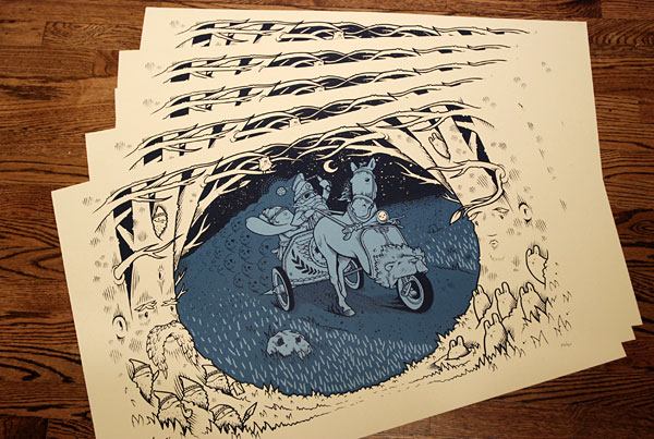
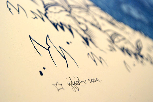
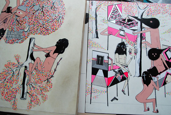
Jeremy Fish
Jeremy Fish's largest print to date is for sale now! It spans a 22" x 34" area, and looks awesome in the frame (but that adds a significant cost!) He's been a big name in the contemporary illustration/paint/street art/etc. scene in the past few years, and this San Francisco based artist has the world by its balls. His collaboration with Aesop Rock is a sight to see. I really like his condensed but articulate pallete and his re-occurring anthropomorphism. A weird detail that I always like in his work is also his edges! Clean, crisp, and perfectly balancing the entire work. Wonderful.
Labels:
awesome,
fecal face,
illustration,
prints,
san francisco
Subscribe to:
Posts (Atom)